


In the latest SONAR release there was a focus on improving the visual elements of the map widget.
- Choropleth index dropdown is now in alphabetical order
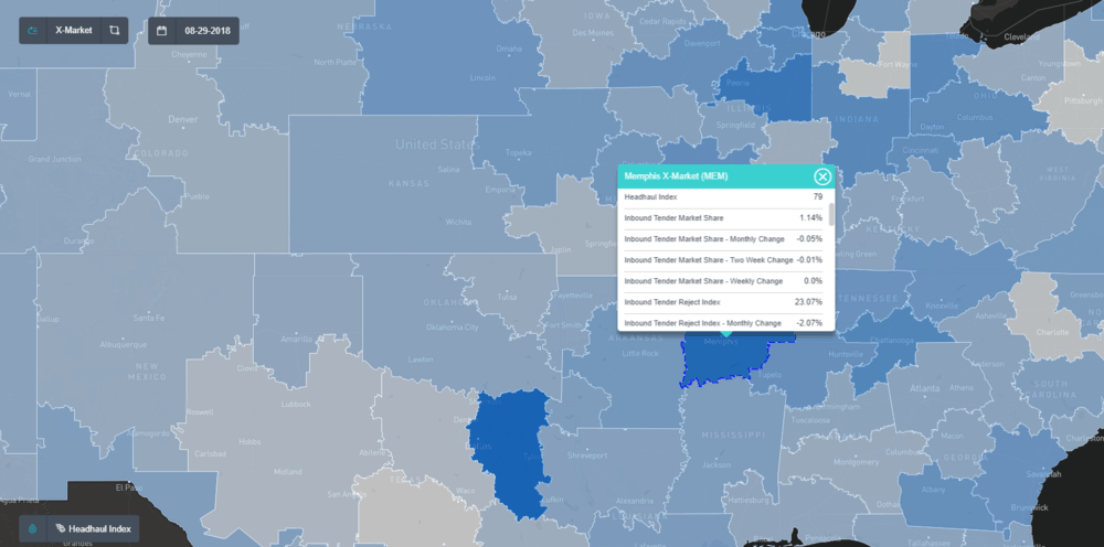
- Redesigned the data popup box to look nicer in general
- Removed the decimal point from whole numbers in the data popup box
- Changed units to lowercase (e.g. CARS to cars) in the data popup box
- The data popup box is now triggered by clicking instead of hovering
- When choropleth is off, the area that is clicked is highlighted (i.e. the opacity is increased)
- When choropleth is on, the area that is clicked has a dotted line border
- Hovering now shows a label with the name of the area
- Moved the choropleth index dropdown from upper right corner to lower left corner to prevent the dropdown from being cut off in maps in smaller widgets
- Widened the drop index dropdown box.
- Moved the zoom slider bar from lower left corner to lower right corner
- Reduced the sensitivity of the zoom slider bar
- Added an icon that toggles whether the various map setting buttons are shown or not:

Watchlist
- Added more space between the filtering arrows and the column headers
Charts
- Fixed bug where , after clicking “Send Symbol to Watchlist”, the previously charted symbol is sometimes sent to the newly created watchlist and the chart sometimes reverts to the previously charted symbol
- Removed light blue line color as a default when comparing symbols on a “Mountain” chart. The colors are too similar for comparison.
One Device Log In
- For security purposes, if a user is currently logged into SONAR on one device, and they then log into Sonar using another device (or another browser on the same device) they will be logged out on the original device (as soon as they navigate to another SONAR page on the original device) and shown a message on the original device that says “You have been signed out because you signed in on another device.”
SONAR is a data-rich visualization dashboard that allows participants to make better operational decisions and plans. SONAR, built by FreightWaves aggregates data from hundreds of sources, representing hundreds of thousands of individual tickers in 135 total markets. SONAR comes packed with a data charting system, map presentation layer, watchlist and news aggregation feed. SONAR data is also available via API to enhance decision support and operational execution systems.
If you are interested in learning more about SONAR setup a demo.
