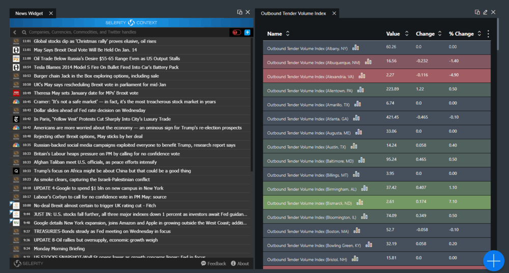
FreightWaves has released the flash news widget for reporting flash news and relevant tweets in SONAR. The new feature is algorithmically based news reporting that targets the most relevant topics affecting financial markets and transportation. Instead of targeting specific sites it targets key words and phrases along with specific individuals giving the user access to the news of the moment without having to dig through multiple web pages. Along with articles, the feed also displays relevant twitter posts, making it a very real time experience.

The flash news feature is located as part of the News widget and can be broken out into a separate browser window outside of SONAR so you can stay up-to-date while working outside of the platform. To enable this feature, you create a new page with a news widget. You will select the option to create a news widget with “Social Media Flash Content” as opposed to the regular “RSS News Articles” that have been the default build until now.

There have also been a slew of feature improvements and standard bug fixes. One of the biggest additions is that users will now have the ability to show two y-axes making it easier to compare two dissimilar data points. Comparing data like oil production which is measured in gallons to diesel price is difficult, even when using a relative percentage option on the chart feature. The price of diesel is in dollars per gallon, a very small number, and oil production is in thousands of barrels, a very large number. Your beginning point can dramatically alter your perception of how each index is behaving on a relative chart. With a secondary y-axis you no longer distort the absolute movement of each value—allowing you to see the relationship between the two pieces of information.

In order to enable the dual Y-axis comparison click on the “Display” option in the upper right of the chart and fill in the circle next to “Dual” under Y Axis Style.


