


FreightWaves, the leading provider of data and analytics to the global freight community will be releasing FreightWaves SONAR 3.2, the biggest overhaul of the freight data dashboard in the product’s history. The release is scheduled for Saturday night. Users that have a current subscription to SONAR will see the updates no later than Sunday, February 17, 2019 at 6AM EST, if not-earlier.
As always, users that are current subscribers will get access to the new data and features, without having to load software or pay anything additional. Think of it as “Netflix” for freight data. New content/features at the same subscription price.
“This release is all about creating a visually-rich experience for the user, pulling in data that can assist them in making daily transactional decisions, along with long-term planning and forecasting decisions. We aspire for a “badass” look. I think our engineering and product teams achieved that and more.” Craig Fuller, CEO and Founder of FreightWaves stated.
Over the past eight months, FreightWaves has launched over thirty SONAR version releases, typically once a week. The majority of those releases were focused on increasing the data that was available on the platform.
The very first SONAR release in May 2018 at Transparency18 had just 10,000 daily time-series data points, aggregating billions in freight transactions, primarily trucking. Today, the platform boasts more than 120,000 daily data-points with much deeper analytics around the entire global freight market, including deeper data around trucking, rail and intermodal data, maritime container data, air cargo, and warehouse data. This is supplemented with thousands of data series that cover economic, census, and commodity data.
In 3.2, FreightWaves overhauled the maps, watchlists, charts, and news section. Basically, everything. Here is the breakdown by visual type:
Maps: The map UX was rebuilt to allow for future mapping features and visual layers that can be added over-time.

Users are now given a set of options on the left-hand window that pops up three different widgets:
-
Date selector:
-
Allows the user to select the date that they want to see data shown on the map. Changing the date will change what date is represented on the map.
-
-
Freight data window:
-
Freight data window brings up a pop-up window which will show different geographical granularities. New granularities include
-
US Markets (matching the DAT markets)
-
Canadian Markets (currently provinces)
-
PADD Markets (for energy and fuel related data)
-
US States
-
US Regions (FreightWaves has created seven regions for the continental U.S., this is great for visualizing regional data)
-
-
The choropleth has a new home. It is now on the left-hand drop out menu “in the tear drop” widget button.

Weather window
-
Toggle between Precipitation and Road Conditions layer

-
Layer allows the user to see weather conditions presented in the precipitation layer map or by surface street and road conditions on the map
-
Location-Specific Data
-
Weather forecast for a specific location
-
Road-cameras
-
Cameras show on the map that highlight real or near-time road activity and are going for getting a feel for conditions on the ground, weather, congestion, accidents, etc.
-
The user can see 20,000 DOT highway cameras across the U.S.
-
-


The user will also have the ability to run animations on the weather layer. This includes both surface conditions and precipitation layers. This shows activity every three hours, for the next forty-eight.

Surface weather conditions are powerful when a user is trying to identify what surface weather conditions will be at anyone point in time on any point on the map. To get a local surface weather condition, the user will click on the map and it will bring up conditions at the point, outlined for the next 48 hrs.
Rather than using air-temperature data, FreightWaves has focused on surface (road) conditions and temperature, which can be different than weather at elevation. This is far more useful for understanding weather that will impact truck drivers along their route.
Location forecast data includes:
-
Road condition (dry, wet, light frost, slush, snow, ice, and possible closure
-
Road temp (will be different than the air-temp)
-
Ice on road
-
Snow on road
-
Hourly rain
-
Hourly freezing rain
-
Hourly snow
-
Hourly ice
-
Wind speed
-
Wind gust

The main workspace was redesigned to create more screen space for the user. The add widget tool has been redesigned and moved to the upper right corner. This allows for more space to be used for data layers and visual tools.


New widgets were also created to bring data to life. Tree-maps, a new gauge feature, and a market table were created in this release.
The tree-map got a complete overhaul, with a focus on bringing the data out to make it more visual for the user. This is perfect for a large screen in the center of a dispatch or brokerage office.


News also received a big upgrade. A few months ago, FreightWaves released a flash-media content feed into the platform. The feed comes from 35,000 highly-filtered Twitter handles about subjects that are relevant to the freight industry, including 600 of the most relevant freight news and freight influencers in the market. The list was assembled from the most influential journalists, analysts, thought-leaders, news publications, and associations in the space. This highly-fitered content allows for news and thoughts to be presented quickly, without the typical noise that makes up Twitter.
The user can search for relevant content and subjects. Want to see the latest news on ELDs, trucking, freight, logistics, Uber, Amazon, Tesla, or the up-coming IMO2020? It is all there.

Also, the RSS news feed has been upgraded to include photos and look more like the social media news feed on LinkedIn or Facebook.
Charts also got a major upgrade. Some of it were aesthetic, others were highly functional and useful. First, let’s start with the new visual layers.
Users can now change colors of charts and design their own themes. This can be a fun way to present data to match a corporate logo color scheme, or to celebrate a favorite sport’s team. Perhaps a patriotic themed Fourth of July, Halloween, or Christmas? A user has tens-of-thousands of options on how to customize their chart colors and designs.


New language features were also snuck in. Users can toggle between chart descriptions and tools in a number of languages. Ticker names are only in English currently, but even these could be updated over-time.

The charts now have a new feature, which is very helpful for drilling into specific period sections of a chart. The range selector will allow the user to select what part of the time series they want to manipulate inside of a chart. This will enable them to show and analyze just that time period. The range is easily moved as the user migrates to different dates along the chart.

Perhaps most useful for fundamental analysis is the new Seasonal chart. This is very powerful when analyzing market conditions, especially pricing and rates. When looking at a chart over a multi-year period, it is difficult to tell how each year patterns to previous years. With the new seasonality chart, users can model each year against one another. It’s like creating new tickers for each twelve-month time splice.

The user can pick how many years they want to model against and compare accordingly. While any data can be used for this purpose, rate and volume data will likely be a favorite. What is really interesting about this is how it eliminates seasonal variation between different time series. Think of it as seaonally adjusted data.
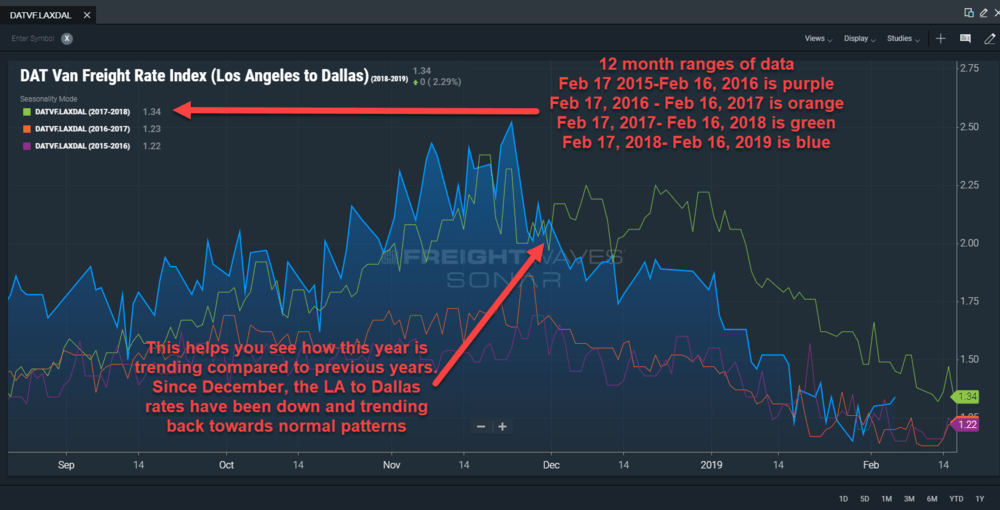
In the above chart, we modelled DAT’s trucking spot rates out of Los Angeles to Dallas since February 17, 2015 to February 16, 2019. The seasonal chart presents each twelve month splice as a seperate data-series. The big blue mountain is the most current period (Feb. 17, 2018-Feb 16, 2019), the other colors represent previous twelve month periods.
In the chart above, we can see that there was a major change in pricing momentum in early December from Los Angeles to Dallas. We also see that in recent weeks, the pricing on this particular lane has returned to a more historically normal pattern. Over the next few months, it will be telling to see how this trends and whether or not 2019 trends at, above, or below the line.
To learn more about SONAR check out the SONAR page or sign up for a demo.