


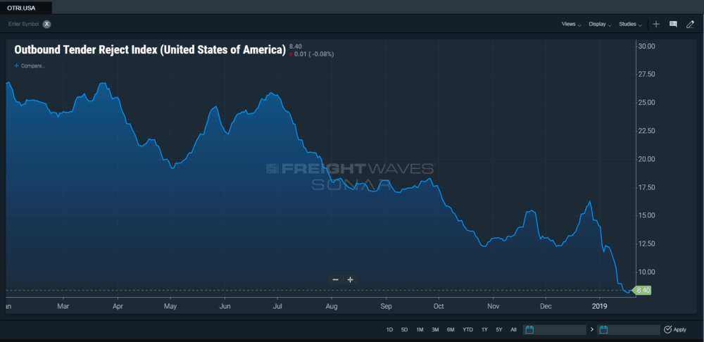
As we discussed last week, there is data suggesting that demand for trucking services remains strong and data suggesting that demand for trucking services are a cause for concern. Fortunately, we believe that there are straightforward explanations for the apparent conflicting trends in data. Beyond what we’ve already discussed: SONAR OTVI (Outbound Tender Volume Index) is already back to levels on par with the average established over the last year; while OTRI.USA (Outbound Tender Reject Index) trended down throughout the second half of 2018 and then plummeted over the first three weeks of 2019.
So why would there be an extremely strong volume of loads being tendered, and almost no loads being rejected? Put another way, why would carriers be accepting almost every load that they were offered?
We think there are several fairly straightforward factors at work:
-
Contract rates have dramatically improved since last year, and spot rates have fallen back below contract rates to a more normalized gap. Hence, the rate being paid for the shipments being offered are high enough to make it worthwhile for the trucking company providing the truck and driver.
-
Since rates of driver pay have improved, trucks have been added to fleets, utilization that was initially lost to the adoption of ELDs has been recovered, and the average age of trucks has fallen. There is more trucking capacity available to move those loads within most fleets.
-
Because of the decline in spot rates, loads accepted at the contract rate by a carrier can also be brokered by its in-house brokerage at a rate that is profitable.
-
The dramatically increased breath and depth of data on trucks, drivers, and loads is allowing the marketplace to create a dramatic improvement in utilization optimization.
We believe there is another factor at work that is adding to the confusion in interpreting the current data. We all fall victim to cognitive biases and highly recommend reading the Wikipedia list of cognitive biases. Is it anchoring, or frequency illusion or recency illusion? We suspect it is a bit of all of those, but is better understood via a simple analogy. Is 60 degrees Fahrenheit warm or cold? After months of bitter cold winter weather with temperatures below freezing, the first sunny day of 60 degrees feels warm and motivates us to wear shorts, t-shirts, open windows, and if you own a convertible, put the top down. Sixty degrees is definitely warm! After months of scorching summer weather with temperatures above 90, the first fall day of 60 degrees feels chilly and motivates us to put on hats, and long-sleeved shirts, and even a light jacket. Sixty degrees is definitely cold.
The current trucking market is in a similar place. Last year, especially in January and February, the capacity constraints of ELDs and the economic surge in both the industrial and consumer economies were producing a scorching hot trucking market that was the equivalent of Phoenix, AZ, in July and August. This year: ELDs have been adopted and utilization with them first adapted and then recovered; the economy is growing, just not at the pace it was in the first half of 2018; normal seasonality of slightly weaker demand in January and February has returned.
So, put the top down and put on a little sunscreen. Sixty degrees is warm and by June of 2019, those claiming that current conditions are cause for concern, will be wondering why all their icy expectations have melted.
Donald Broughton – chief market strategist for FreightWaves
The smartest minds on Wall Street use charting analytics to quickly identify and then track trends in multiple data sets. Why? Because it works. Even the most intelligent investor or skilled trader identifies patterns in numbers when they are charted far faster than when those numbers are simply displayed in columns and rows. Graphically depicting data becomes more important when you are trying to compare two or more data sets and understand the relationship between them over time. When viewing a chart of a couple of data sets that are related, you begin to understand the reason of the marketplace. If you can add a series of technical indicators to the graph, you begin to understand the rhyme and the reason of the marketplace.
SONAR allows you to quickly view graphical series of data, many of which weren’t previously available to professionals trading the marketplace. More importantly, it allows you to view those data series compared to other data series (some proprietary, others not) and then apply the type of sophisticated technical indicators to the data series that are normally reserved for Wall Street. Patterns in the data don’t just sit there quietly as numbers; they literally jump off the screen at you. What are a few of those ‘jumping off the screen’ at us right now?
